
Mobile-First: Your Customers See Your Site on a Phone
For most local businesses, the customer's journey starts on a phone. Here is what mobile-first design means and how I apply it in my projects.
 Habib S. · Ldora

When a café or shop owner shows me a design for their website, they almost always open it on a big laptop screen. Their customers don't see it that way. A customer is in a taxi, at work or on the sofa, holding a phone in one hand and scrolling with a thumb. If the site isn't built for that moment, it doesn't matter how good it looks on a computer: the customer leaves within seconds. Here is what "mobile-first" means and how I apply it in my own projects.
What "mobile-first" actually means
Many people think a mobile site is just the desktop site squeezed onto a phone. That is "responsive" in the weakest sense, not mobile-first.
Mobile-first means the design starts on the narrow phone screen. The first question is: what does the customer need to do, with one hand, on a small screen? Once that task is simple and quick, the layout opens up for larger screens.
The order matters because a phone forces you to choose. What is really needed? Which button is the main one? Which text can go? A site that answers those questions also ends up cleaner on a desktop.
Your customers arrive on a phone
For most local businesses, the customer's journey starts on a phone: a link on Instagram, a message from a friend, a Google search. All of it happens on a phone, and that is where they land on your site.
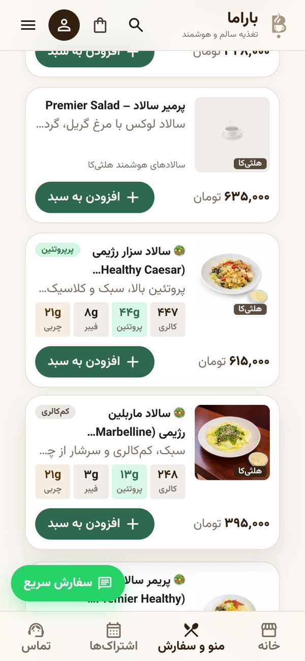
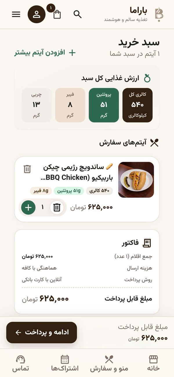
At Cafe Barama in Shiraz, I built online ordering so the whole path is comfortable on a phone. Customers choose dishes, see calories, protein, carbs and fat for each one, and the cart totals the nutrition of the whole meal. That is a lot of information, and if it looks crowded on a small screen nobody reads it. So I designed the layout for the phone first.
The same thinking runs through my other projects, from the building app for a 9-unit building to the supermarket POS that staff use at speed: how does a busy person finish the task in the fewest steps?
What changes on a small screen
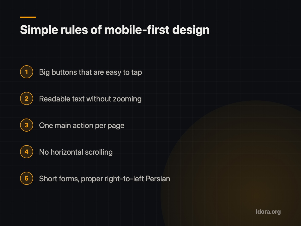
A few practical rules I follow in every mobile design:
- Big, well-spaced buttons that are easy to hit with a thumb.
- Readable text without zooming in. Customers rarely zoom; they leave.
- One main action per page, such as "Add to cart" on a dish page.
- No horizontal scrolling. Nothing should stick out past the screen edge.
- Short forms. Every extra field is one more reason to give up.
- Proper right-to-left Persian with a readable font, which shows even more on a small screen.
Speed on mobile internet
On a phone, customers are usually on mobile data, and in Iran that is not always fast or stable. A page that loads quickly on office Wi-Fi can be slow, or only half load, on a phone.
So in my projects:
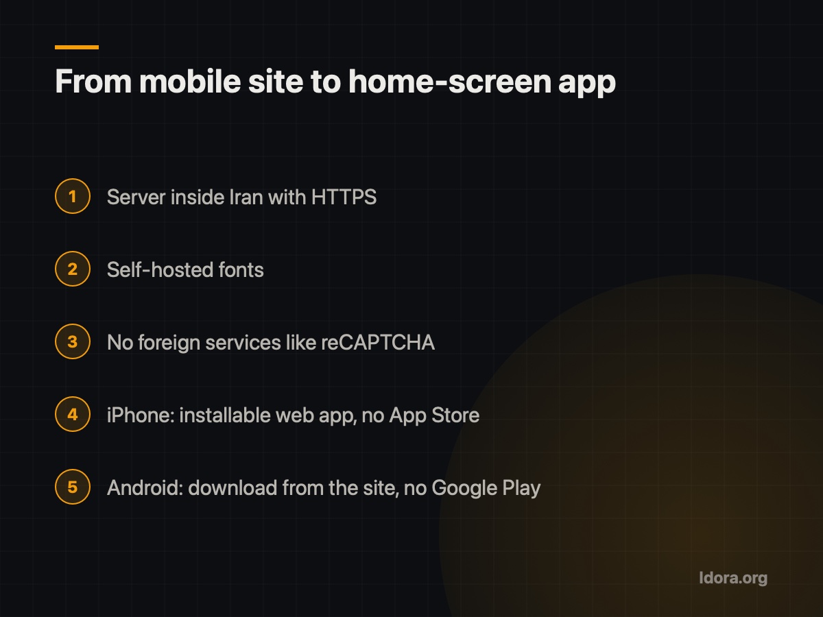
- Sites run on a server inside Iran with HTTPS.
- Fonts are self-hosted, not loaded from Google Fonts.
- No Google Analytics, reCAPTCHA or other foreign services that can slow down or break a page under filtering.
The page doesn't depend on anything outside the country, so it opens more reliably on a customer's phone.
From website to app on the home screen
Once a site works well on a phone, the next step is easy: customers can keep it on their home screen like an app.
For Cafe Barama we offered two routes:
- iPhone: the site is an installable web app (PWA), added to the home screen without the App Store.
- Android: the customer app downloads straight from the café's own website, without Google Play.
This only makes sense if the site was designed for phones in the first place. Otherwise you are just putting a frustrating experience on the home screen.
You can watch the demo video on the Cafe Barama project page.
A mobile checklist for your site
Try these yourself, on your own phone:
- Open the site with one hand and go all the way to the last step (order, call or form).
- Check that nothing sticks out past the screen and there is no sideways scrolling.
- Read the text without zooming.
- Find the main button on each page at a glance.
- Test on mobile data, not only Wi-Fi.
- Count the form fields and remove the ones you don't need.
If you want your business website or software built for your customers' phones from day one, I deliver mobile and desktop versions together in every project, and I show you a free demo before you decide anything. Request a free demo and we can look at how your site should work on a customer's phone.
Want something like this?
Tell me about your business
More guides

SEO Basics for a Small Business in Iran
Why can't customers find your business site on Google? Simple SEO basics: page titles, descriptions, real content and technical points that matter in Iran.
Read
Café Online Ordering: Your Own Site or Snappfood?
Snappfood is a marketplace; your own ordering site is your home. From building Cafe Barama's system: what each one does and when you need both.
Read
Sayad Cheque and Instalment Reminders: Never Miss a Due Date
Why cheque and instalment due dates get missed, and what a good reminder system needs, from building Wealth with SMS reminders and a private document vault.
Read